
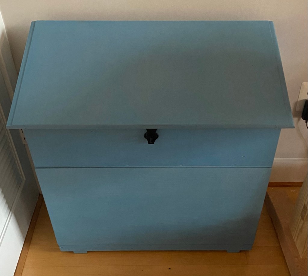
I learned that Picasso went through a blue period where he only painted monochromatic work in shades of blue. Looking at some of my recent builds, I noticed a monochromatic theme (charred finish and waxed white spruce) and, when turning to color, I used a shade of blue milk paint for painting my Dutch tool chest. While I’ll leave the psychoanalysis for a different day, I’ll discuss my experience using milk paint obtained from “The Real Milk Paint Co.”. Of note, I purchased this product with my own funds.

1) Environmentally safe and non-toxic. Paints commonly used in the house are comprised of more that one-third plastics. Today, the plastics found in paint are not natural latex from rubber trees but are synthesized from various fossil fuels. Considering the concern about the accumulation of environmental microplastics and that most “latex” paints are just an emulsion of microplastics, I like the fact that milk paint has a favorable environmentally safety profile as it is made from proteins found in milk and non-toxic pigments and uses water as a solvent. Fossil-fuel-derived plastics are not renewable and have limited biodegradability, which results in an environmental half-life around 100 years. In contrast, milk proteins are renewable and biodegradable. Moreover, the lack of volatile organic solvents or compounds released upon application also reduces the hazards associated with applying this indoors without extensive ventilation.
2) Low waste factor. Given my recent experience in trying to get rid of unused partial containers of house paint, I really like that Real Milk Paint comes as a powder. You only mix up what you plan to use. The rest can be stored indefinitely. They also include a marble in the container, which helps to mix up the batch.
3) Pleasant tactile sensations. In comparison to surfaces painted with milk paint, a surface painted with a “latex” paint sometimes has a tactile stickiness. This is because a “latex” paint is an emulsion of plastic microparticles (think bubble tea). Once the solvent evaporates, the painted object is covered with plastic microparticles (all bubbles and no tea). These plastic microparticles then coalesce, which makes the dried paint difficult to redissolve. As typically these particles are created such that they have an affinity for the solvent (recall that oil and water don’t mix), which is water in this case, the tackiness that you feel with the painted surface, unless you live in a low-humidity desert, is because the surface is never really dry. Milk paint on the other hand creates a chemical bond with the surface and the milk protein casein cross-links to create a very durable surface. The net effect is a very hard surface that you can even sand. The downside is that milk paint is really difficult to remove once it dries, so choose your colors wisely.
4) Mixing ratios are based on volume. Instructions say that you should combine the paint powder in a 1:1 ratio with water. Christopher Schwarz recommends a 1:2 powder:water ratio. Given my background, I decided to break out the kitchen scale and weight out a 1:1 ratio to start. Well it turns out that weight ratios are a bit different than volume ratios. Ten milliliters of powder equal about 6 grams. Given that water has a density of 1 gram/ml, a 1:1 weight ratio corresponds to a 1.7:1 volume ratio and a really thick milk paint. While that thick milk paint gives good coverage, the painted surface doesn’t level out once the paint is applied with a brush leaving a rather rough surface. For the second and third coats, I went with more of a 1:1.5 volume ratio. This worked better in terms of providing a smoother surface at the expense of coverage.
5) Wet sanding works to level the surface. As I didn’t like the rough surface left over from the first coat, I decided to wet sand all surfaces with 400 grit sandpaper and boiled linseed oil as a lubricant. This smoothed out the surface and shifted the color of the milk pain from a bit chalky in appearance to a darker hue. Overall, I think the wet sanding worked well.
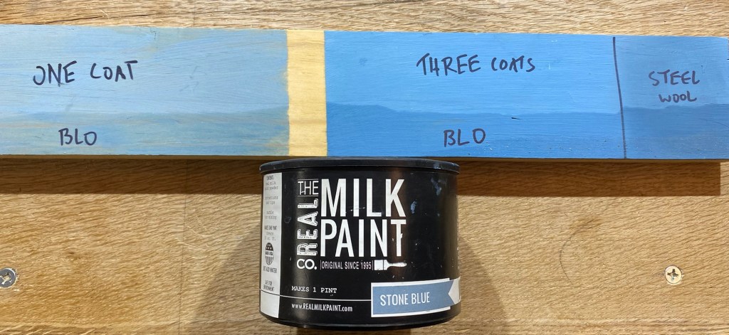
6) Burnishing the surface. Using techniques I learned in John Porritt’s “The Belligerent Finisher”, I did some burnishing of the surface with a chain-mail potscrubber instead of using steel wool. I think using chain-mail potscrubber provides the burnishing effect without the sanding effect of steel wool. Burnishing the surface changes the surface from flat to a bit semi-gloss. While burnishing, I did notice that the paint didn’t adhere to some areas of the Dutch tool chest. As it was quite a while between making and painting the Dutch Tool chest, I think these were areas where I repeatedly touched the chest. Oils from my hands may have limited paint adhesion. Comprehensive sanding of all surfaces prior to painting may have improved paint adhesion. In addition, I made a test panel to see what the different treatments did to the color. In short, using milk paint from “The Real Milk Paint Co.” had a bit of a learning curve but I’m really happy with the results.
